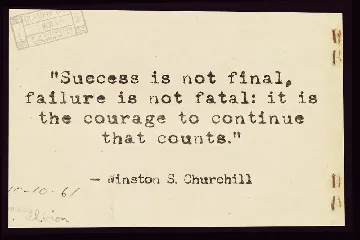
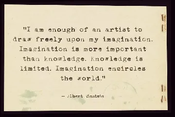
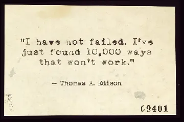
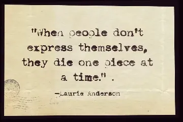
Not my type typewriter font
Typewriter font with contextual alternatives making it look more realistic
About Not my type typewriter font
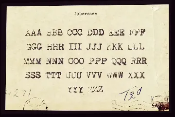
Not my type font was created with a real typewriter. To be specific it was on Oliver courier typewriter that I bought at an antiques market.
I originally bought it for one of my image packs but it seemed to make sense to create a typeface from it.
Contextual Alternatives
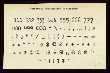
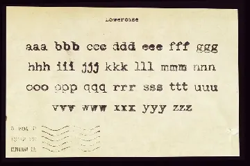
I created 3 versions of every letter and number that get progressively bolder. If you enable contextual alternatives in your design application the letters will change automatically as you type.
The aim was to make it look more random, like a real typewriter.
Lot of detail
I went to great trouble to keep the detail from my original scans. I've yet to see another typewriter font that has the same amount of detail as this one.
The font includes:
- One style
- Uppercase & Lowercase letters with three Alternatives
- Numbers with three alternatives
- Basic punctuation & Symbols
- Font format is .OTF
If you want your design to have that nostalgic type effect this is perfect. It's old fashioned and retro with just a hint of grunge.
Similar fonts

Durendal & Oliphant font
Download Durendal & Oliphant font free | Tup Wanders
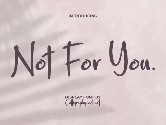
Not For You Demo font
Download Not For You Demo font free | CalligraphyFonts.net
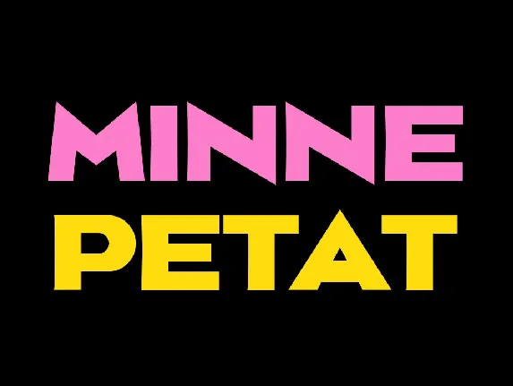
Minne Petat font
Download Minne Petat font free | Myfonts Pring
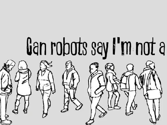
Can robots say I'm not a robot? font
Download Can robots say I'm not a robot? font free | junkohanhero

Yanone Kaffeesatz Family font
Download Yanone Kaffeesatz Family font free | Myfonts Pring
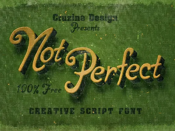
Not Perfect font
Download Not Perfect font free | cruzine
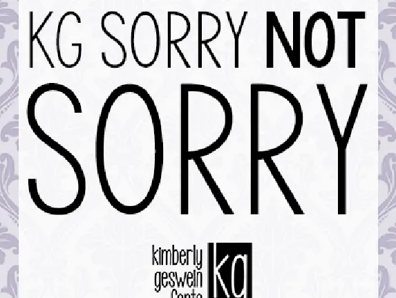
KG Sorry Not Sorry font
Download KG Sorry Not Sorry font free | Kimberly Geswein
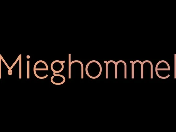
Mieghommel font
Download Mieghommel font free | Tup Wanders

