Munson Fontlog
FONTLOG
Munson font family
====================
by Paul J. Miller
Status
------
Munson is a free font, free in the sense of free of restrictions and DRM but also free in the sense of cost.
Under the terms of the license you may use Munson in any kind of publication, print or electronic, without fees or restrictions. You may modify the font for your own use. You may distribute your modified version in accordance with the terms of the SIL license.
You may use Munson for any purpose including commercial usage.
Munson is licensed under the SIL Open Font License: for the full text, go to http://scripts.sil.org/OFL.
You can release any publications you produce under any license terms you want. You may use it for your latest book and sell the book either on paper or in electronic form without any restrictions or requirements.
The only thing you may NOT do is sell the font on its own as a stand alone font.
If you are producing an electronic document for someone else and they don't have Munson installed on their system the document might not be rendered correctly. However you are free to give them a copy of Munson so they can install it on their system. If you are going to do this it would be better to give them the .ZIP file you downloaded, but this is not a requirement because the .OTF files contain the license information within the relevant fields of the font file itself.
Munson may be embedded in a .PDF file without any restrictions.
Description
-----------
I had the need for an old fashioned typeface for a graphic design project, something remeniscent of the Victorian printing. I decided on a Clarendon style typeface. When you start looking for a free Clarendon typeface you will find many which are exceedingly good but expensive (not free). Then you will find a small number which are free but not very good. Many of them don't have an italic form or they have italics which are just slanted versions of the upright face.
I missed out on the graphic design project but if it comes around again I will be ready.
So an old fashioned typeface, Clarendon is an iconic typeface of that era, it has been used in signage and advertising many many times.
There was a typeface by a company called Stephenson Blake in Sheffield. This typeface was made around 1815 and was called Consort. It was a bracketed slab serif face with ball terminals where appropriate. I have obtained scanned documents and typeface samples from that era which depict the Consort typeface and some scanned advertisments from America from the 1950's which are in a typeface I believe to be Consort. I have attempted to re-create the look and style of the Consort typeface in a modern font.
But some of the characters in the Consort typeface were not to my liking so I have designed Munson according to my own aesthetic preferences. There is also much of Clarendon in Munson. The Clarendon typeface was first made by Robert Besley in London in 1845 and is particularly well known. Munson is an amalgamation of all these influences, a sort of hybrid between Consort and Clarendon with some of my own influence thrown in for good measure.
The italic had to be distinctive and so I chose images of the fancy italic characters in equations from various Mathematics text books. It started with the 'i', 'x' and 'y' characters but spread into the rest of the characters. The leading and trailing tails of the italics are exagerrated, as indeed are the serifs of the upright font. I cheated here, rather than make an italic lower case set from scratch I just copied someone else's (from a free open source font) and then butchered them horribly. I dislike starting with a blank canvas. This is not new or original, it is fashioned after Craw Modern italic, a typeface be Freeman Craw around 1960 and also Monotype Modern Italic. It just looked right, rather than having the italics as an oblique version of the upright, using oblique for italic is a cop out but it is what most of the free Clarendons do if they bother with italics at all. I do not posess a copy of Craw Modern but there are scanned images on the web and much of the design was a hand and eye copy of scanned images.
The construction of Munson has been achieved at a very fast pace due to starting out with a slab serif font which I designed three and a half years ago using Font Forge. That font was not very good but provided a starting point for further work. Also many of the incidental characters were copied from 'Kelvinch' (one of my previous fonts) and modified if necessary.
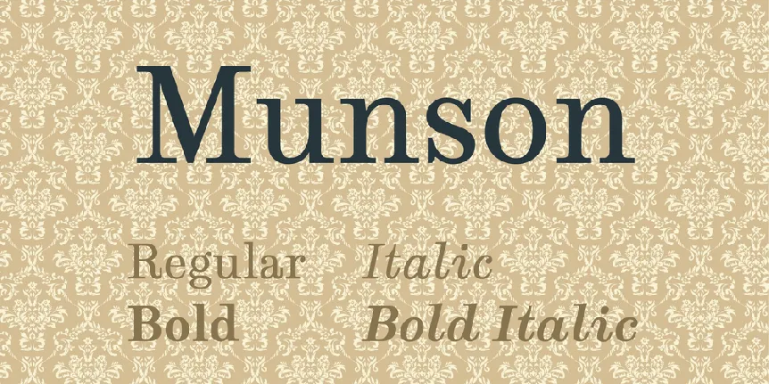
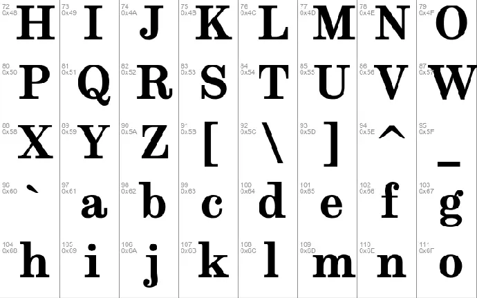
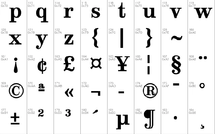
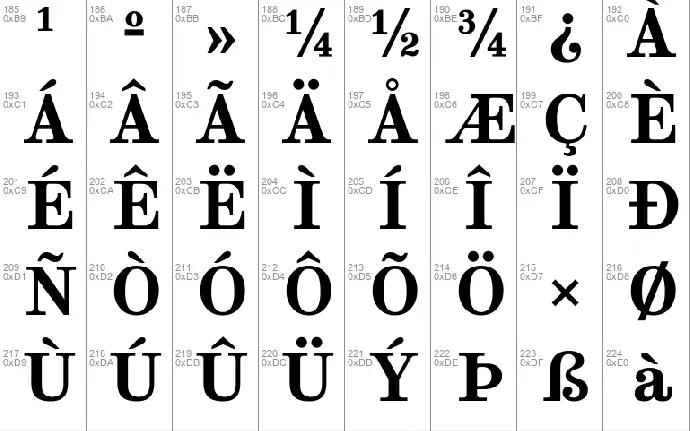
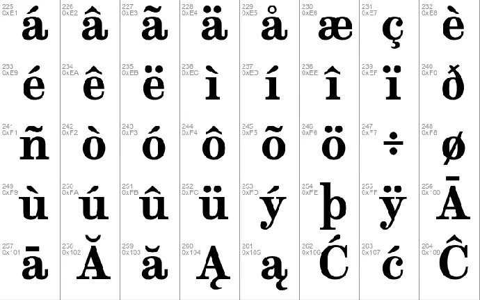
Munson comes in Regular, Italic, Bold and Bold Italic faces.
_________________________________________________
This font was made in Sheffield, South Yorkshire!
¯¯¯¯¯¯¯¯¯¯¯¯¯¯¯¯¯¯¯¯¯¯¯¯¯¯¯¯¯¯¯¯¯¯¯¯¯¯¯¯¯¯¯¯¯¯¯¯¯
ChangeLog
---------
(This should list both major and minor changes, most recent first.)
22nd July 2017
Someone on the TypeDrawers forum mentioned some problems with the Open Type features in 'Kelvinch' so I fixed them, then I realised that the same problem existed for Munson, but much worse, so I fixed Munson as well.
Following some of the comments on the Typedrawers forum I beefed up some of the curved stems in Munson because they appear too thin in the Roman and Italic fonts, beefed up one or two of the curved stems in Bold and Bold-italic as well but not as many or as much. Adjusted some of the numerals to make the curved parts more even. Adjusted the numeral 2 in the Roman and Bold font to be more upright.
15th July 2017
Found a problem with the open type features. When Old Style numerals were enabled the fractions feature didn't work. I fixed this by re-arranging the order of the lookup tables so the fractions feature preceeded the old style figures feature.
Found a problem with the open type features. When small caps was selected the polish localisation didn't work. This could not be corrected by re-arranging the lookup tables. If small caps came first then the accented characters c,n,o,s and z which had a creska would be rendered with a normal acute accent. If the polish localisation came first then these characters would be rendered as normal lower case with a creska.
This was solved by adding small capital versions of c,n,o,s and z which had a creska and including these characters in the small caps table.
1st to 13th July 2017
Tweaked the bearings.
Tweaked the kerning.
27th to 30th June 2017
Edited the open type features. Small Caps, Ordinals, Language Localisations and Old Style Figures.
The earlier kerning table was deleted and a new much smaller table was added.
6th to 25th June 2017
Put a lot of anchors in glyphs for the positioning of diacritic marks.
1st June 2017
Re designed the mu character in the italic and bold-italic fonts because it was the last remaining character which was an oblique version of the upright when it should have been italic.
1st to 17th April 2017
Finished off the remaining outlines. All outlines completed (unless I add more characters), next job is the Open Type features.
24th March 2017
More tidying up of the Latin Extended-B character set in Roman, Italic, Bold and Bold-Italic.
Made a start on the open type features, this was a disaster. I copied the open type script from another typeface thinking it would give me a head start but most of the features stopped working.
Deleted the Open Type script.
22nd March 2017
More tidying up of the Latin Extended-B character set in Roman, Italic, Bold and Bold-Italic.
21st March 2017
More tidying up of the Latin Extended-A character set in Roman, Italic, Bold and Bold-Italic.
20th March 2017
More tidying up of the Latin Extended-A character set in Roman, Italic, Bold and Bold-Italic.
19th March 2017
The numbers have had some ball terminals added but apart from that they are still straight out of Kelvinch. I spent all day editing the 2 and the 7 to look more Victorian block printing. Then propogated the change to italic then bold and then bold-italic. Also re-designed the 1 character.
Sterling character in Consort looked awful so I looked at a rendition of Sterling in Clarendon and tried to copy that character. I copied the character by hand and eye because the scanned image was too blurry at that magnification to permit an import of the bitmap image. The result is not bad.
Re-designed the italic z which looked awful.
18th March 2017
Corrected the positions of the diacritic marks in the Latin-1 Supplement in Roman, Italic, Bold and Bold-Italic.
17th March 2017
Continued to tidy up the mess which is the bulk of the bold-italic font.
Re-designed the Amphersand character, copied to italic and made oblique. Copied to Bold and made bold. Copied Bold Amphersand to Bold-Italic and made oblique.
16th March 2017
Continued to tidy up the mess which is the bulk of the italic and bold font.
Added many more glyphs by using 'Complete compsites', these are composite glyphs which are combinations of existing glyphs.
Continued to tidy up the mess which is the bulk of the upright font.
15th March 2017
Spent all day tidying up some of the mess generated by my earlier attempts to get things dont too quickly. The a-z, A-Z and the numbers are now reasonably presentable but I will need to go through them at some point to tidy up and check for mistakes.
14th March 2017
Spent all day filleting slab serifs. This would have been a lot easier in Font Creator 10 but for some reason the toggle point on/off curve command has been removed.
13th March 2017
I have taken three weeks off work. This was due to the fact that I have lots of leave left and cannot carry it over to next year (April 1st) but it does give me a good opportunity to get things moving with the new font.
Spent all day butchering the italic and bold-italic characters to make them into something more Math Textbook-ish, with exagerated tails and ball terminals where appropriate.
The numbers are still straight out of Kelvinch. Modified the numbers on the upright fonts to give them some balls (ball terminals that is) then copied the numbers into the italic fonts and slanted them by 12 degrees.
12th March 2017
Made two more copies of the font.
Slanted the upright font by 12 degrees to give an italic font. Replaced the lower case italics with the lower case italics from the Acariya italic font by Bhikkhu Pesala because they were the most similar to what I wanted to achieve.
Emboldened the upright font by expanding the vertical uprights by 100 units also some of the bowls were emboldened in the same way.
Copied the italic font to a bold italic font then emboldened it in the same way as the bold font.
Filled in some of the gaps, copied more glyphs from kelvinch.
It has been a long day!
11th March 2017
I have enrolled on the Beta Test of the new version of Font Creator. I need a throw away font to edit so that at the end of the test I do not have to buy the new version of Font Creator if I decide not to (depends on the price).
I have decided to revive one of my early project which is most similar to the font I want to produce. It is a slab serif with unbracketed serifs. My early work was abysmal, but now I have more experience and know how to change curves to the way I want them to look.
I started with the upright font which just contained the letters and numbers and one or two other characters.
Copied many characters from 'Kelvinch' to fill in the gaps.
Acknowledgements
----------------
(Here is where contributors can be acknowledged. If you make modifications be
sure to add your name (N), email (E), web-address (W) and description (D).
This list is sorted by last name in alphabetical order.)
N: Paul James Miller
E: [email protected]
W:
D: Original Designer and main contributor.


