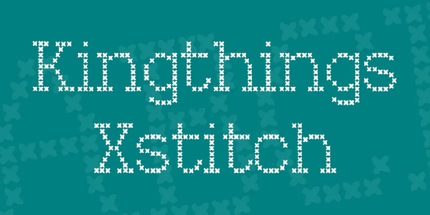
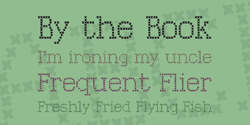
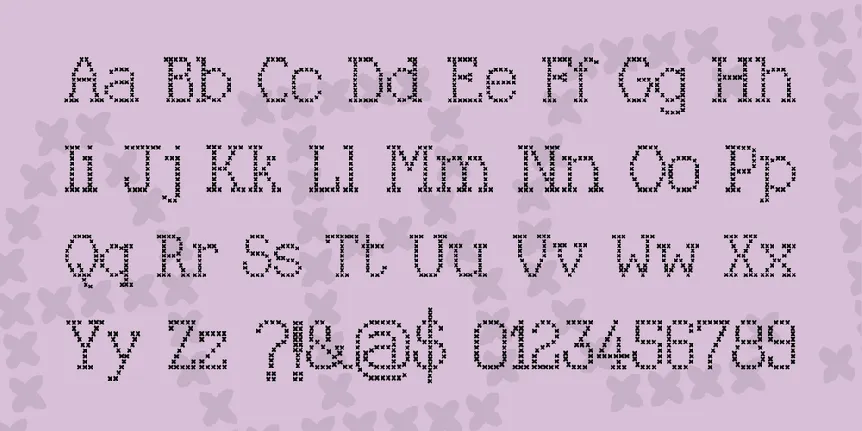
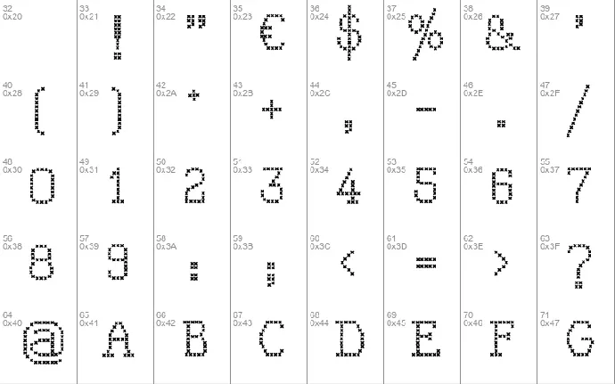
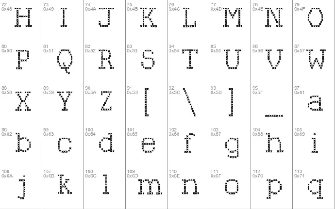
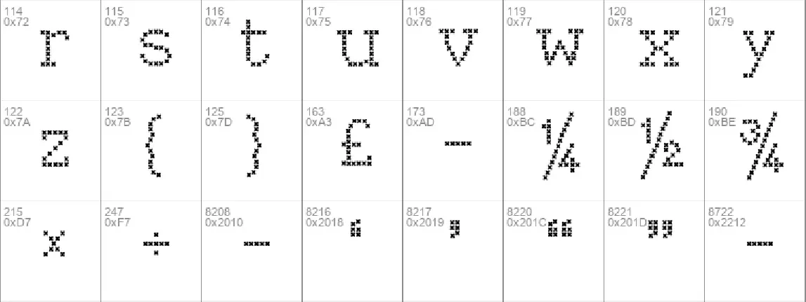
Download free Kingthings Xstitch font - Kingthings
About Kingthings Xstitch font
Because I couldn't find one when I wanted one- it doesn't 'work' at small sizes! Again, there are others out there, this is mine!
Download font
Free for Personal Use
This fonts are authors' property, and are either shareware, demo versions or public domain. The licence mentioned above the download button is just an indication. Please look at the readme-files in the archives or check the indicated author's website for details, and contact him if in doubt. If no author/licence is indicated that's because we don't have information, that doesn't mean it's free.
Kingthings Xstitch Regular | Kingthings Xstitch.ttf
- Font family: Kingthings Xstitch
- Font subfamily identification: Regular
- Unique identifier: Kingthings Xstitch by Kingthings 2004
- Full font name: Kingthings Xstitch
- Version: Version 1.0 January 2004
- Postscript font name: KingthingsXstitch
- Trademark notice: Kingthings Xstitch is a registered trademark of Kingthings.
- Manufacturer name: [email protected]
- Designer: Kevin King, Exeter, England.
- Description: Penbuilt - well based on
allfontsinfo
Kevin King - March 2010
Hi! Thanks for reading my fonts Info file.
My currently available fonts and those in development are, in some sort of 'order':
01. Kingthings Calligraphica
02. Kingthings Calligraphica Italic
03. Kingthings Calligraphica Light
04. Kingthings Xander
05. Kingthings Xander Outline
06. Kingthings Gothique
07. Kingthings Petrock
08. Kingthings Petrock Light
09. Kingthings Organica
10. Kingthings Hand
11. Kingthings Hand Light
12. Kingthings Kelltika
13. Kingthings Italique
14. Kingthings Chimaera
15. Kingthings Sans
16. Kingthings Whizzbang
17. Kingthings Flashbang
18. Kingthings Flourishes
19. Kingthings Linear K
20. Kingthings Printingkit
21. Kingthings Spike
22. Kingthings Spikeless
23. Kingthings Wrote
24. Kingthings Xstitch
25. Kingthings Annex
26. Kingthings Poppalok
27. Kingthings Embroidery
28. Kingthings Wrote
29. Kingthings Facetype
30. Kingthings Extortion
31. Kingthings Versalis
32. Kingthings Lupine
33. Kingthings Lupineless
34. Kingthings Christmas
35. Kingthings Willow
36. Kingthings Willowless
37. Kingthings Piquenmeex
38. Kingthings Trypewriter
39. Kingthings Exeter
40. Kingthings Inkydinky
41. Kingthings Clarity
42. Kingthings Eggypeg
43. Kingthings Spirogyra
44. Kingthings Knobson
45. Kingthings Conundrum
46. Kingthings Serifique
47. Kingthings Serifique Light
48. Kingthings Serifique Ultralight
49. Kingthings Gutenberg - not yet available
50. Kingthings Foundation
51. Kingthings Tendrylle
52. Kingthings Stirrup
53. Kingthings Bloone!
54. Kingthings Sheepishly
55. Kingthings Wrecktangle
56. Kingthings Scrybbledot
57. Kingthings Widow
58. Kingthings Lickorishe
59. Kingthings Frontwards
60. Kingthings Backwards
-----------------------------------------
Below, you will find some thoughts and information on my fonts. In some sort of 'order', they are:-
-----------------------------------------
01. Kingthings Calligraphica
is based on calligraphic lettering hands which I learned at school - a bit of a confusion of different forms that I liked. I now use this letterform for most of the hand calligraphy that I still produce - just works for me - never can remember the uppercase 'N' though...
-----------------------------------------
02. Kingthings Calligraphica Italic
This is based on Kingthings Calligraphica, I don't like the way that some fonts turn out when 'italicised' by word et al, so I thought that I would make a 'real' italic - it took more doing than I thought it would.
-----------------------------------------
03. Kingthings Calligraphica Light.
It is based on Kingthings Calligraphica. I made it because people feeding back from my website and from using my fonts asked for a lighter version - in much the same way as Petrock Light came about in fact! Also I have noticed that my 'normal' weight fonts tend to be on the heavy side - so Light!
-----------------------------------------
04. and 05. Kingthings Xander and Xander Outline.
Both are based on a pen built form that I doodled when watching Telly - must say something about my telly choices! These doodles turned into Kingthings Xander and then Anne suggested an outline form because she can't find one she likes - so here it is. It has undergone several changes since then mainly due to email feedback.
-----------------------------------------
06. Kingthings Gothique.
Is based on Kingthings Xander, again it was Anne's prompting that led to this font, she said
"You know, I can't find any fonts that are really different" to use for my Oxfam posters (although a little of this font goes a long way!) Finally I was very pleased with this font, one of my favourites.
-----------------------------------------
07. and 08. Kingthings Petrock and Petrock Light.
These are based on a labelling face I found used in a tiny city church in central Exeter - it was in a display case regarding bell ringing. The light font was designed to make Kingthings Petrock more useable, and may end up as an Italic too. It has had some modification to make it suitable as a Windows font but retains most of the flavour of the original.
-----------------------------------------
09. Kingthings Organica.
Was originally developed at Art College in 1981 - at the time it was called Roxanne and was hand drawn at an X height of about 4 inches - took weeks and weeks! Fun though. Finally made into a proper font - sorry to all those who downloaded it before I had tidied it up - but then I do change all of them at the merest whim...
-----------------------------------------
10. and 11. Kingthings Hand and Hand Light
This is based, arrogantly on my own hand writing, when writing up course notes, I thought - hmm, could use voice recognition and a handwriting font... sad really. Then it got sadder 'cos I was asked for something not so bold - although the light version may end up as the normal weight - later!
-----------------------------------------
12. Kingthings Kelltika.
This is based on characters from the Book of Kells and other calligraphic works. I wanted to make a font based on these letter forms for a long time - it has taken me a while to get it right and I'm afraid that it is subject to change at a whim - as are all my fonts! There are no real capital letters in the documents that I have been working from, so I have, as there, enlarged the lower case, dropped the base line and decorated them. The decorations really need to be larger than 36pt to show up.
-----------------------------------------
13. Kingthings Italique.
Again this is based on a calligraphic hand that I evolved from those I learned at school. I wanted to do this one just for me as I like the spiky look of it when set as solid text.
-----------------------------------------
14. Kingthings Chimaera
This font is based on Kingthings Hand - I wanted to play with a font to see what i could add in the way of decoration and what it would do to the way the font 'set' and the file size... Then I decided to release it as I liked what happened.
-----------------------------------------
15. Kingthings Sans
I made this font because I fancied designing a font that was definitely Sans Serif but had fiddly bits and was more decorative. It is based on Kingthings Hand. Yes, I agree, it is peculiar... I like peculiar! If you like peculiar too, take a look at Kingthings Chimaera, it's based on this font.
-----------------------------------------
16. Kingthings Whizzbang
Kingthings Whizzbang Started as an experiment and then folks wanted it completed... I have got there in the end. Unfortunately, it has spawned and now we have Flashbang... and Poppalock...
-----------------------------------------
17. Kingthings Flashbang.
This font is based on Kingthings Whizzbang - I enjoyed making it so much that I only occasionally had time to wonder why The Font Creator Program was struggling - it's about ten times the size of a 'normal' font. This is because fonts are made up of individual bits called glyphs - there are just rather a lot of them...
-----------------------------------------
18. Kingthings Flourishes
This is not a font, it was made to go with my fonts Petrock and Calligraphica - you will need to use a graphics program like Serif Page/Draw Plus or Paint Shop Pro (etc) to use it - oh, and character map - to see which flourish is which - as they are mapped to random letters - no I don't know which ones!
-----------------------------------------
19. Kingthings Linear K.
I wanted to make a font with the simplest possible forms that I could use over and over again in font creator - like stick drawings - just lines, hence linear. I may come back to it - haven't really worked out where I want it to go - and it hasn't expressed a preference... Looks nasty though which is always a start!
-----------------------------------------
20. Kingthings Printing Kit
I had one as a child - Red rubber letters, and ink that was extremely unforgiving - Oooo she did get cross! Anyway, it was called 'The John Bull Printing Set' and I spent hours losing the letters, cutting fingers on sharp tweezers and trying, surreptitiously, to get the ink off the priceless antique lace tablecloth - sometimes I think I even printed things with it!
- This is a small homage. Oh and I like deconstruction too...
-----------------------------------------
21. and 22. Kingthings Spike and Spikeless
Are the most intractable faces that I have worked with (until I started Wrote!) I made them originally because Buffy has her own font - (find it on the web called 'Buffied') - I made one for Xander - Spike is another small tribute to a fabulous show. Spikeless makes Spike more useable because if you want to actually need to be able to read the lettering, Spike can be a little over the top.
-----------------------------------------
23. Kingthings Wrote
After making Kingthings Hand - which was supposed to be informal and flowing - and turned out completely different - they do that, fonts, like wayward children; I wanted to make a font of my handwriting that I could use for notes - I tried once before and came up with Kingthings hand which was far too stiff - I had considerable problems getting this one to work - as ever the more free and flowing a font needs to be, the more formal work it takes to make it useable. I'm still learning.
-----------------------------------------
24. Kingthings Xstitch.
I just made this font because I wanted one for a project I was working on and couldn't find one - of course, since then, kind souls have found several for me... Well this one is mine and did what I wanted it for - I do like the Ray Larabie one though...
-----------------------------------------
25. Kingthings Annex
Obviously based on Kingthings Organica. Annex Lives in the Annex and signs everything Annex, She is a real Earth Mother type - bless her, and constantly plants, fails to water and swears at, and then paints and draws flowers. I love her deeply - so this font is for her.
-----------------------------------------
26. Kingthings Poppalok.
This is based on Kingthings Whizzbang - it is actually Anthea's fault - if you want someone to blame, (and it never hurts), she said, when I showed her whizzbang, -Oh yes, reminds me of those beads you used to get, years ago- - Poppalok beads, I played with them for hours when I was a child - Mum had them in all colours, and some very strange combinations when I had finished!
-----------------------------------------
27. Kingthings Embroidery.
I made this font after finding an old embroidery transfer book where I work - at Oxfam in Exeter - my fonts are often sparked from finding something that has been 'thrown out' - there is often charm that has been, gone, and come back again - this font has a lovely feeling of the initialled handkerchiefs that my dad had kept since the thirties and forties.
-----------------------------------------
28. Kingthings Wrote
This font has taken the longest time to make - there have been so many versions none of which i was happy with. Finally i had to release it just to get it out of my hair - so here you go. It may not be the final version - and on the other hand, as things stand right now, if i never saw this font again it would be too soon - however, never say never...
-----------------------------------------
29. Kingthings Facetype
I made this font having thought of the name - maybe not the usual way to go about font design. It is based upon Kingthings Exeter and can be used to embellish that font or just as decorated capitals. I enjoyed making this font and it was one of the quickest to do - i just got completely absorbed by the project. I hope you enjoy this daft font!
-----------------------------------------
30. Kingthings Extortion
This font has taken a
while to get right - I felt that a supposed ransom note should at least try to look a little random - as if torn out and pasted down - hence no upper or lower case as such, just letters to interchange. I think it works OK.
-----------------------------------------
31. Kingthings Versalis
Kingthings Versalis - Both contained in the same font file, this font only contains capitals as they are supposed to be Versals - i.e. they were used in illuminated manuscripts for the capital letters starting verses. They work well with my calligraphic fonts. I made both a solid and an outline form because I can use one to 'fill' the other when overlaid.
-----------------------------------------
32. and 33. Kingthings Lupine and Lupineless
I love fantasy writing and my favourite author is Terry Pratchett. In Reaper man, my favourite book, there is a werewolf character called Lupine, I wanted to make a font for him and for Ludmilla... It's a long story, it's a hairy font.
-----------------------------------------
34. Kingthings Christmas
Kingthings Christmas - Based on Kingthings Petrock - this is a display font and needs to be used at least an inch high to see any detail. Happy Christmas! (Yes, I know it's July, sheesh!)
-----------------------------------------
35. and 36. Kingthings Willow and Willowless
I made a font for Xander and one for Spike, Buffy has her own (available on the web and called Buffied), So I thought it was time I made one for the Character Willow. If all this means nothing to you, I am a Buffy the vampire slayer fan... 'Nuff said I think.
These fonts are both the same - with embellishments in Willow, making it possible to use both the fonts without complete madness setting in. They were originally designed to look like a sheaf of willow wands - it was all a bit too much so I formalised them to these simpler forms
-----------------------------------------
37. Kingthings Piquenmeex
Kingthings Pique'n'meex - A change is as good as a rest - fed up with detailed tweaking of foundation (coming soon) (probably days more like!) I had a funny five minutes and came up with this. I loathe Arial and Times for their ubiquity... of course the main problem is designer laziness - i can do that!
-----------------------------------------
38. Kingthings Trypewriter
Is taken from my old typewriter that now sits dusty unrepentant and snarling under the bed whilst various forms of word processor come and go - yes it is getting on for 90 years old, yes the sticky ribbons give me black fingers and spludgy letters. I love it - now you can share... You don't get the grumbling, swearing or bruised fingers though.
-----------------------------------------
39. Kingthings Exeter
I wanted to make a really simple pen built font with no serifs, as usual, the simpler the font, the more work it took to get it right. It's named for where I live, it was about time.
-----------------------------------------
40. Kingthings Inkydinky
I am making a font called Kingthings Serifique (well, that's what it's called this morning) - I got side tracked - again! I was filling and testing fountain pens for the Charity Shop in which I work... Mother always said I'm a filthy Herbert. Doesn't a little Ink go a long way?
-----------------------------------------
41. Kingthings Clarity
Many moons ago, I had an email asking me if I had thought of making a Dyslexia font - one where letters aren't easily confused, I hadn't - now I have. I apologise if there are still confuse-ables - email me and let me know.
-----------------------------------------
42. Kingthings Eggypeg
Gary asked me if there was an easter font to go with Kingthings Christmas - I hadn't even thought of it so I had a go and enjoyed making this font enormously. If you need plainer letters to go with it, it is based on Kinghtihgs Willowless, so you can mix it with that... NOTE: You will need to use Character Map (Or the much better Character Map Pro - available free on the web), to access the image characters - although they should all be available on standard keyboards. For example, the pile of eggs is accessed with the \ key, The Easter egg in the grass is the shifted < key.
-----------------------------------------
43. Kingthings Spirogyra
I doodle you know...I remember with wonder, Biology lessons at 'big' school, with Microscopes, and a filamentous pond weed called Spirogyra. There were spirals in it! and a nucleus like a star! and then 35 years later (or so), I doodled Kingthings Spirogyra idly watching TV.
-----------------------------------------
44. Kingthings Knobson
Having made Spirogyra, a decorative font, I found I liked the way the lower case set as text, so I made separate capitals to go with them, and Voila!, we have Kingthings Knobson... (if we're not very careful, Oh, too late - fonts spontaneously generate you know, like Elephants.
-----------------------------------------
45. Kingthings Conundrum
I have said before you know - I can if I want to (Stamp! Scowl!)
Cod Chinese of the worst kind, I wanted a 'Chinese' font for a project and couldn't find what I wanted. I painted this font with a Chinese brush and imported the resultant mess - it's been a while since I did any Chinese calligraphy - add that to the fact that I don't read or speak Chinese...
-----------------------------------------
46. Kingthings Serifique
I suppose that eventually all font designers think something like "I really hate Times NEW Roman", - and have a go at a standard serif face themselves... Well it's taking a while
-----------------------------------------
47. Kingthings Serifique Light
-----------------------------------------
48. Kingthings Serifique Ultralight
Having started Serifique, I realised that I actually needed a serif face - right now - and immediately started this face to meet my needs. At some point I will create the 'father' font of this typeface - but it's bloody typical that I did this arse about face, as it were... (I did, it's two lines up).
-----------------------------------------
49. Kingthings Gutenberg - Not yet available
When I wanted one, I couldn't find the Gutenberg font I wanted - one that will 'set' like the original type. There are others available, mine will take a while yet...
-----------------------------------------
50. Kingthings Foundation
Having made so many calligraphic fonts, I realised that I had a 'hole' and couldn't quite put my finger on it... Eventualy I realised that I hadn't finished one of the first fonts I started, a version of the first Alphabet I learned to letter. It's useful for simple lettering like quotes or instructions in boxes written small - it stays quite legible at small sizes... It has taken quite a while - but I think I like it.
-----------------------------------------
51. Kingthings Tendrylle
I seem to be making more organic fonts at the moment - I seem to be surrounded by green things which is a little odd as I live in the middle of a (small) city. I also grow plants on my kitchen windowsill - whatever comes my way - at present, my favourites are insectivorous plants... There are also all the beads and necklaces that are donated to Oxfam - the charity for which I work... One thing leads to another - and I end up with yet another decorated font. I Am Unrepentant!!! HaHaHaHa!.. (Oh dear, oh dear).
-----------------------------------------
52. Kingthings Stirrup
Detailed work on Tendrylle meant that I needed a break; and as I am mad, the break took the form of another font. Stirrup is built of pre-made shapes, more or less, so it was quite quick to do - oddly, not much work and I really like it! If only it happened more often...
-----------------------------------------
53. Kingthings Bloone!
Exactly what is says on the tin - no more no less - I still hate that letters are the same as each other in display faces (?) so no upper and lower case, just alternates to be mixed up.
-----------------------------------------
54. Kingthings Sheepishly
I like sheep... ZzZzZzZzZzZz...
-----------------------------------------
55. Kingthings Wrecktangle
I bought a book about cutting edge audio from the 70's - after I stopped laughing, I made this font. It's a bit like the one used on the book cover. It makes me smile as no-one can read it and my college tutors would shudder... it''s odd how things stick.
-----------------------------------------
56. Kingthings Scrybbledot
The Scrapbooking People have asked for grungey fonts - and this is one of my efforts to comply. I scribbled the letters in Paintshop Pro and imported the results into my font program directly. This is the first font i have created directly on the computer without any paper sketches - I think it took more work!
-----------------------------------------
57. Kingthings Widow
This font started out as something entirely different - called 'Elspeth' - don't know why, but there will probably be a Kingthings Elspeth at some point... As I began my process, cobwebs and spiders kept turning up - it may have been around Halloween. I love spiders because i have always disliked flies - well it makes sense to me, and I leave a spider ladder over the edge, when there's a little eight legged freind in the bath...
------------------------------------------
58. Kingthings Lickorishe
This was almost Kingthings Leechy... just another one of my bulbous shiney things - i have always liked letter-shapes with 'bottom', probably a 70's thing as many a seventies thing did indeed posess it - including Chaka Kahn... Oooh, Diva!
------------------------------------------
59. Kingthings Frontwards
Daft font based on Times New Roman - I claim no copyright to this font and its sibling Kingthings Backwards - they are both intended to be 'filler letters' to be used with the parent font - I can do subversive in a very small way - the odd letter thrown into a letter to a bank manager, makes a grey day very slightly brighter.
-----------------------------------------
60. Kingthings Backwards
Daft font based on Times New Roman - I claim no copyright to this font and its sibling Kingthings Frontwards - they are both intended to be 'filler letters' to be used with the parent font - I can do subversive in a very small way - the odd letter thrown into a letter to a bank manager, makes a grey day very slightly brighter.
-----------------------------------------
I am constantly working on all my fonts so these may well not be the last versions, please check my web site at:
www.kingthingsfonts.co.uk
for updates and new fonts.
I hope you enjoy using my fonts and I would appreciate any feedback from you regarding missing characters, things that would be useful, bits that don't work and so on. Also, please let me know if you have downloaded it for use on a Mac - I have had some reports of Mac versions not working... Please email me at:
[email protected]
-----------------------------------------
Thank you
Regards
Kevin King
Exeter, England - February 2009
kingthingsEULA
Kingthings EULA - (End User License Agreement).
All the fonts currently published on my website (www.kingthingsfonts.co.uk) are free for you to use for any purpose you wish. Please do not change my original font files (.TTF).
There are some paid-for versions of my fonts (with much enhanced character sets) available from to buy from www.cheapprofonts.com, these contain their own EULA and are not included or implied in this notice.
Please enjoy all your creative work - and if you come up with anything you like, I would appreciate a picture.
Regards
Kevin King
Exeter, England - February 2009
More by Kingthings
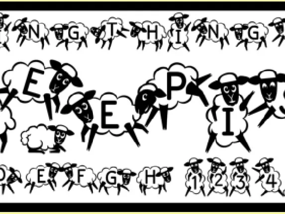
Kingthings Sheepishly font
Download Kingthings Sheepishly font free | Kingthings
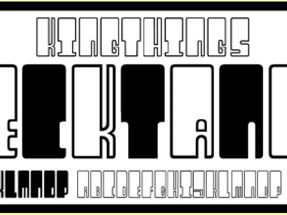
Kingthings Wrecktangle font
Download Kingthings Wrecktangle font free | Kingthings
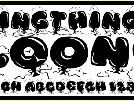
Kingthings Bloone! font
Download Kingthings Bloone! font free | Kingthings
Comments (0)
Lastest update
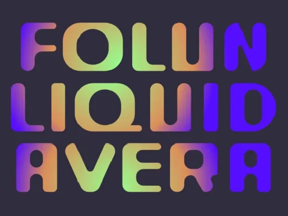
Warriot Round Display font
Download Warriot Round Display font free | ffeeaarr
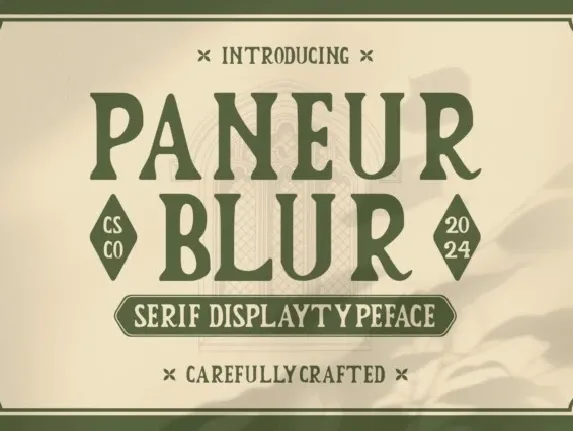
Paneur Blur font
Download Paneur Blur font free | Craft Supply Co
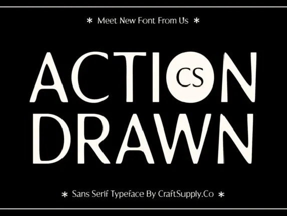
CS Action Drawn font
Download CS Action Drawn font free | Craft Supply Co
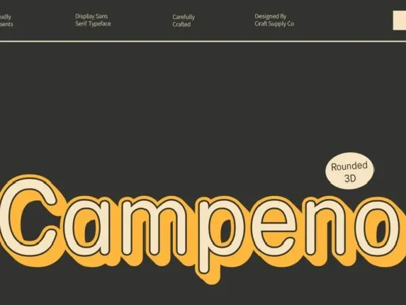
Campeno Rounded 3D font
Download Campeno Rounded 3D font free | Craft Supply Co
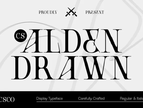
CS Alden Drawn font
Download CS Alden Drawn font free | Craft Supply Co
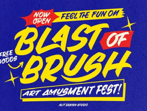
House Of Hands font
Download House Of Hands font free | alit design
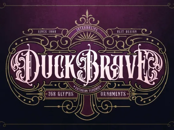
Duck Brave font
Download Duck Brave font free | alit design
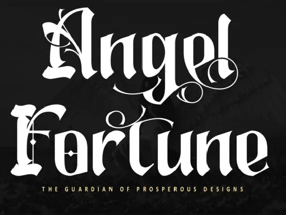
Angel Fortune font
Download Angel Fortune font free | letterara
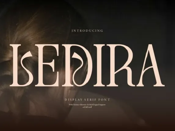
Ledira font
Download Ledira font free | Denustudios

