Download free Farisea Fraktur & Layered font - deFharo


Farisea Fraktur & Layered Font
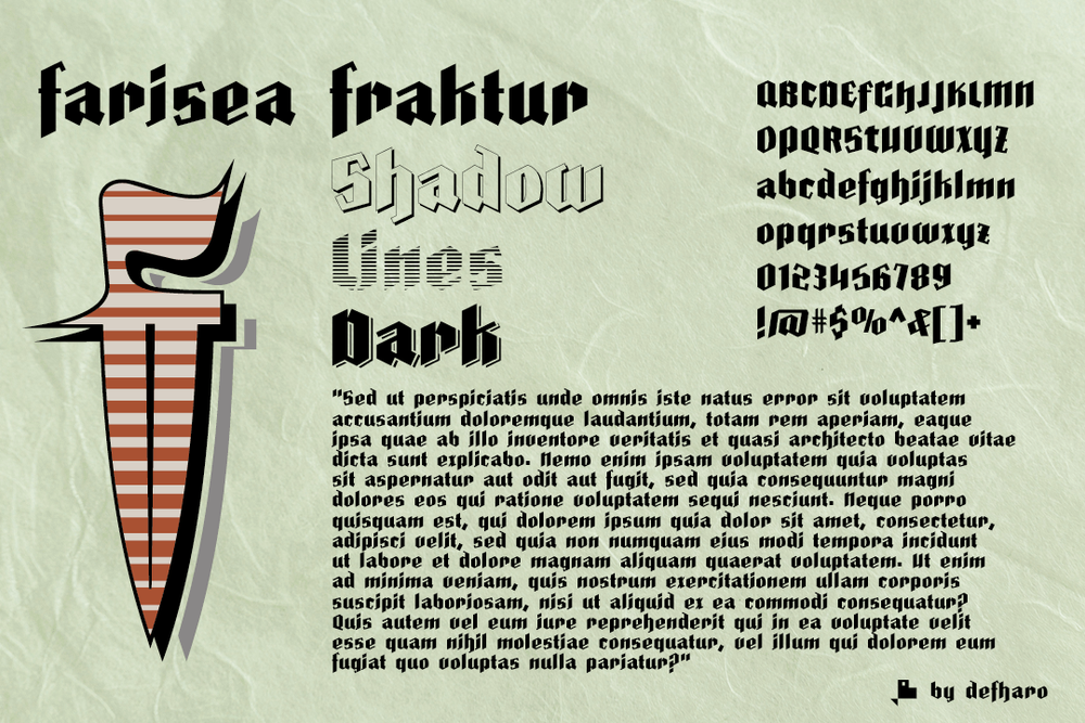
Fraktur is a typographic style of the Latin alphabet derived from the Gothic writing that arose at the beginning of the XVI century and was popularized in Germany, Northern Europe and the Baltic countries. These fonts are distinguished by their thick strokes and the angled profile produced by the pen. Farisea Fraktur is my modern version of this type of Fraktur fonts, without embellishments, the initial inclination is of 64 ° for the upper and lower ascending finials, it has a great contrast between antlers and a generous height of x, which gives the font in a square proportion.
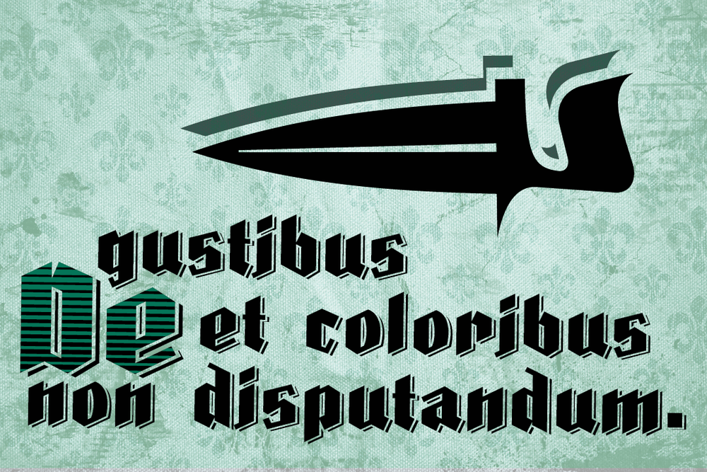
On this occasion I offer 4 versions of the typography combinable by layers to create multicolored holders purely typographical. Today, this type of fonts continues to be used for the creation of diplomas, etc. also in some German-speaking press media, also having many followers among tattoo enthusiasts.
=============
FULL VERSIONS & COMMERCIAL LICENSES
Download font
Free for Personal Use
This fonts are authors' property, and are either shareware, demo versions or public domain. The licence mentioned above the download button is just an indication. Please look at the readme-files in the archives or check the indicated author's website for details, and contact him if in doubt. If no author/licence is indicated that's because we don't have information, that doesn't mean it's free.
- Farisea Dark Regular Farisea-Dark-demo-ffp.ttf
Farisea Dark Regular | Farisea-Dark-demo-ffp.ttf
- Font family: Farisea Dark
- Font subfamily identification: Regular
- Unique identifier: Version 1.186;DFHA;FariseaDark;2018;FLVI-611
- Full font name: Farisea Dark
- Version: Version 1.186
- Postscript font name: FariseaDark
- Trademark notice: Farisea Dark is a trademark of deFharo.
- Manufacturer name: deFharo
- Designer: Fernando Haro
- Description: Fraktur is a typographic style of the Latin alphabet derived from the Gothic writing that arose at the beginning of the XVI century and was popularized in Germany, Northern Europe and the Baltic countries. These fonts are distinguished by their thick strokes and the angled profile produced by the pen. Farisea Fraktur is my modern version of this type of Fraktur fonts, without embellishments, the initial inclination is of 64 · for the upper and lower ascending finials, it has a great contrast between antlers and a generous height of x, which gives the font in a square proportion.
- License: Personal use only (FFP)! Leer / Read: https://defharo.com/product-usage-agreement-ffp/ Commercial license. READ: https://defharo.com/terms-and-conditions-commercial-fonts/ Please visit www.defharo.com to buy a commercial license.
Farisea Fraktur Regular | Farisea-Fraktur-demo-ffp.ttf
- Font family: Farisea Fraktur
- Font subfamily identification: Regular
- Unique identifier: Version 1.183;DFHA;FariseaFraktur;2018;FLVI-611
- Full font name: Farisea Fraktur
- Version: Version 1.183
- Postscript font name: FariseaFraktur
- Trademark notice: Farisea Fraktur is a trademark of deFharo.
- Manufacturer name: deFharo
- Designer: Fernando Haro
- Description: Fraktur is a typographic style of the Latin alphabet derived from the Gothic writing that arose at the beginning of the XVI century and was popularized in Germany, Northern Europe and the Baltic countries. These fonts are distinguished by their thick strokes and the angled profile produced by the pen. Farisea Fraktur is my modern version of this type of Fraktur fonts, without embellishments, the initial inclination is of 64 · for the upper and lower ascending finials, it has a great contrast between antlers and a generous height of x, which gives the font in a square proportion.
- License: Personal use only (FFP)! Leer / Read: https://defharo.com/product-usage-agreement-ffp/ Commercial license. READ: https://defharo.com/terms-and-conditions-commercial-fonts/ Please visit www.defharo.com to buy a commercial license.