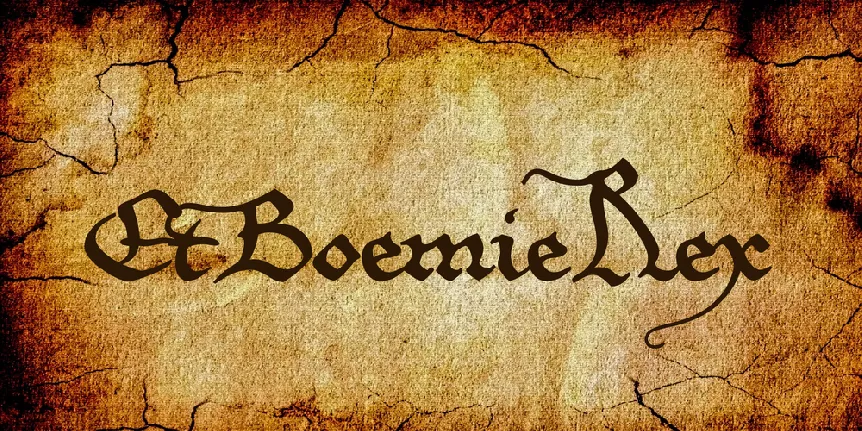
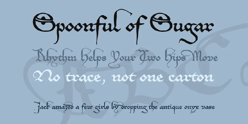
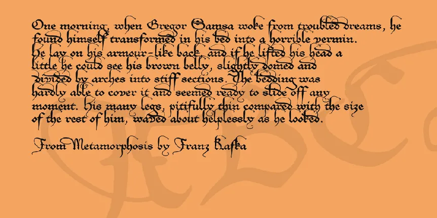
Download free EtBoemieRex font - Pia Frauss
About EtBoemieRex font
Ruling from 1346 to 1378, the German emperor Charles IV was the most glamorous scion of that shortlived house of Luxembourg, which showed such a distinct drive eastward. His grandfather had come out of France to be German emperor, his father was king of Bohemia, and his younger son Sigmund -- last male of the family -- would, by his own wish, be buried at Oradea (aka Nagyv÷rad, aka Groüwardein), which belongs to Romania today, but was then (1437) an eastern outpost of Sigmund's beloved kingdom of Hungary. Not that the direction mattered much, though. They were real vultures, trying to take hold of anything within their reach. At one time, Charles and his father even battled in northern Italy, bent on creating another kingdom for themselves there.
Around the year 1350, Charles IV bothered to compose his own biography, no doubt intending to spare historians the pains of doing much research into his life and deeds; and historians have gratefully copied from his text for centuries, assuring posterity of how he has been such an incomparably charismatic, cultivated, peace-loving, just, wise, skilled, successful, and deeply religious ruler. For all we know, he was indeed doing miracles in his inherited kingdom of Bohemia, above all at Prague, having the cathedral built, founding the university, and shaping the city into the fascinating capital that can still be admired today. And yes, he lavished gifts on artists and intellectuals, who sung his praises in return.
As a matter of fact, Charles needed money to maintain his style of life and ruling, and the ways in which he got it, were pure evil. Let's not dwell upon his merits in creating and advancing the German city leagues he had expressly forbidden, by pawning each and everything -- e.g., whole dukedoms, as well as free cities -- to the highest bidder (who would then, of course, try to profit from the deal by imposing tremendous taxes on his new subjects); those leagues were sometimes quite successful in fighting off the consequences of the emperor's greed. Let's rather contemplate another piece of news, which was unearthed by modern history: In the month of June 1349, Charles entered into secret negotiatons with the city council of Nuremberg, concerning the disposal of the estates of Nuremberg's Jewish citizens, in case of a pogrom. Some months later, that pogrom took place, no doubt after being carefully organized by the city council. Nearly all the Jews at Nuremberg were killed, the booty being then divided between the killers and their gracious sovereign. Actually, this oh so pious ruler couldn't lose, with all the killing of Jews that went on during his reign. The Jews being his immediate subjects, anyone who killed a Jew owed the emperor money, and whenever a city entered on a pogrom without sagely negotiating beforehand, Charles pounced upon them in impressive protector mode, threatening retributions, and cashing in exorbitant fines ... what a hypocritical, cunning rascal.
If historians are to be trusted, Charles' greatest feat consisted in persuading the electors to establish his son as his successor in the office of Roman king. Indeed. The son in question was glorious V÷clav/Venceslas of WirWenzlaw renoun... Though, considering his father's complete lack of a conscience, and his younger brother Sigmund's treacherously declenching the terrible Hussite wars, by ingeniously redefining the notion of safe conduct -- e.g., 'you'll reach Constance unharmed, but if they burn you at the stake there, I wash my hands of you' --, it has to be admitted that Venzlav, for being obnoxious like the plague, may not have been, by far, the worst of the whole lot.
Is there anything I like about Charles IV? Why, alas, yes. The charters of his chancery tend to be stunningly elegant -- a cultivated prince's pride, for sure, and a font maker's dreams come true. In the end, that market privilege granted to the city of Hambourg, in 1359, proved irresistible. Beauty and morality entering into conflict, beauty won, as always, producing the EtBoemieRex (= 'And King of Bohemia', a quote from the document) font. However, conscience is still refusing to give in; and that's why I've inflicted this soap box monologue on all who have read thus far. Thank you for your forebearance.
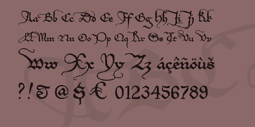
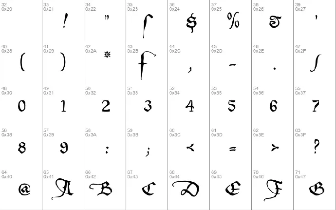
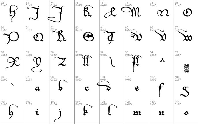
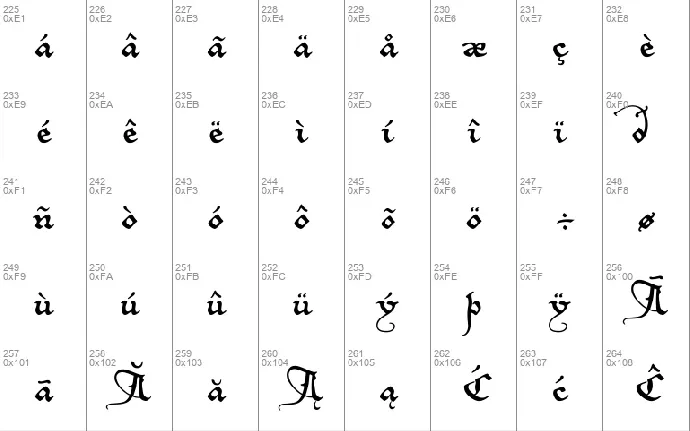
On the number sign of the EtBoemieRex font, you'll find a long s, as usual. The other special characters are
- an alternate f on the 'plus' sign, since the normal one is at war with the i, and a lot of accented characters
- an alternate d on the 'bar' and 'broken bar' sign, less bulky than the normal one
- a double l on the left bracket
- an fl ligature on the right bracket
- a swashed m on the left curly bracket, to be used at the end of a word
- a swashed n on the right curly bracket, to be used at the end of a word
- a long s+t ligature on the long s sign
- an ft ligature, and a swashed t on the fi and fl keys. If these characters aren't reachable on your computer, you might try the masculine and feminine ordinal indicators, or the 'less-than or equal to' and the 'greater than or equal to' signs.
- and, just in case, if you really need a 'plus' sign with this font, you'll find it on the 'plus/minus' sign.
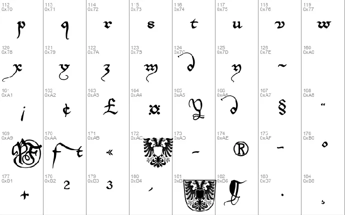
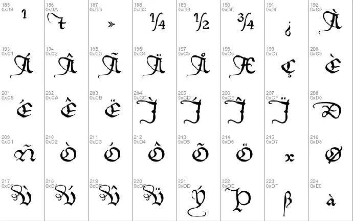
Update 2010 has redesigned all of the composite glyphs (correcting the dcaron, Lcaron/lcaron, and tcaron), and enlarged the dashes.
Download font
Free for Personal Use
This fonts are authors' property, and are either shareware, demo versions or public domain. The licence mentioned above the download button is just an indication. Please look at the readme-files in the archives or check the indicated author's website for details, and contact him if in doubt. If no author/licence is indicated that's because we don't have information, that doesn't mean it's free.
EtBoemieRex Regular | EtBoemRU.ttf
- Font family: EtBoemieRex
- Font subfamily identification: Regular
- Unique identifier: EtBoemieRex:Version 1.10
- Full font name: EtBoemieRex
- Version: Version 1.10 June 2010, initial release November 2007
- Postscript font name: EtBoemieRex
- Designer: Pia Frauss
- Description: EtBoemieRex was created with the Font Creator Program from High-Logic.com
- License: If you want to use this font commercially, please visit http://www.pia-frauss.de/imp/cu.htm
EtBoemR
EtBoemieRex
________________________________________________
... is a UNICODE font created by Pia Frauss in 2007, with High-Logic's FontCreator program, and updated in 2010. You have downloaded the 1.10 version.
I hope you'll enjoy this font.
EtBoemieRex is free for private use. For commercial use, please visit my "Conditions of Use" page at
http://www.pia-frauss.de/imp/cu.htm
The EtBoemieRex font is based on a charter issued in 1359 by the German/Roman emperor Charles IV, granting a market privilege to the city of Hambourg.
On the number sign of the EtBoemieRex font, you'll find a *long s*. The other special characters are
- an alternate *f* on the 'plus' sign, since the normal one will collide with the i and a lot of accented characters
- an alternate *d* on the 'bar' and 'broken bar' sign, less encumbrant than the normal one
- a double *l* on the left bracket
- an *fl* ligature on the right bracket
- a swashed *m* on the left curly bracket, to be used at the ending of a word
- a swashed *n* on the right curly bracket, to be used at the ending of a word
- a *long s*+*t* ligature on the long s sign
- an *ft* ligature, and a swashed *t*, on the fi and fl keys. If these characters aren't reachable on your computer, you might try the masculine and feminine ordinal indicators, or the 'less-than or equal to' and the 'greater than or equal to' signs.
- and, just in case, if you really need a 'plus' sign with this font, you'll find it on the 'plus/minus' sign.
UPDATE 2010 has redesigned all of the composite glyphs (correcting the *dcaron*, *L/lcaron*, and *tcaron*), and enlarged the dashes.
_________________________________
Disclaimer:
1. The designer as well as owner of this font is Pia Frauss.
2. This is a free font, but it is restricted to personal use only. Commercial use may be obtained by paying a licensing fee.
3. This font may not be included in any commercial compilation of fonts, be it on CD, disks or other products, without the owner's permission.
4. Altogether, this font may not be used for commercial ends and financial gain without the owner's permission.
5. This font may be freely distributed, as long as the zipfile, including this text, remains unaltered.
6. This font comes as it is. There is no warranty -- express or implied -- offered by the owner, or supplier. The risk of any losses or damages resulting from the use of this font remains wth the user.
If you need any information not supplied by this or by the http://www.pia-frauss.de/ website, please write to fonts @ pia-frauss.de (please remove the spaces around the *@* before copying the address into your mail form).
(However, please note that no enquiries such as "how do I download/install/get such and such program to work with your fonts" will be answered in the future.)
More by Pia Frauss
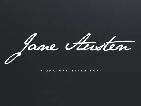
Jane Austen Signature font
Download Jane Austen Signature font free | Pia Frauss
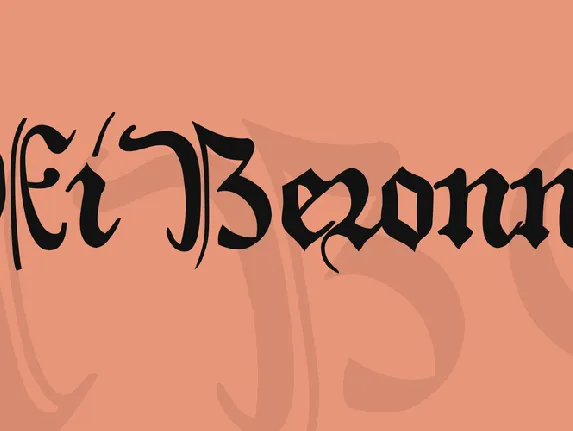
XiBeronne font
Download XiBeronne font free | Pia Frauss
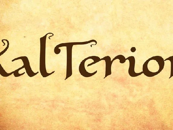
XalTerion font
Download XalTerion font free | Pia Frauss
Comments (0)
Lastest update

Olbars font
Download Olbars font free | Gracetypestudio

Almandite font
Download Almandite font free | Rais Project Studio

Baby Winter Display font
Download Baby Winter Display font free | Scratchones Creative

Christmas Halloween Display font
Download Christmas Halloween Display font free | Scratchones Creative

Higland Sunshine Display font
Download Higland Sunshine Display font free | Scratchones Creative

Angelic Calligraphy font
Download Angelic Calligraphy font free | creativeletter

Royale Calligraphy font
Download Royale Calligraphy font free | creativeletter

Americano Script font
Download Americano Script font free | creativeletter

Hangout Calligraphy font
Download Hangout Calligraphy font free | creativeletter

